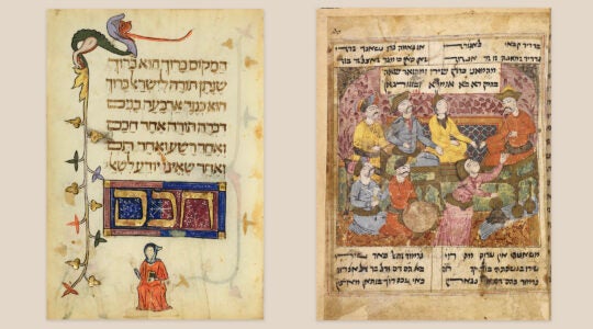
In April, I wrote about two emerging challenges to the dominance of the ArtScroll siddur among the American Orthodox public. One of those challenges, the first English translation of the popular Israeli siddur pubilshed by Koren, boasts a fresh translation from the English chief rabbi, Jonathan Sacks, and Koren’s legendary artistic sensibility.
In Tablet magazine, Joshua Friedman delves further into the matter with a fascinating piece about what makes Koren’s publications so beloved and provides some insight into the man behind the book, company founder Eliyahu Koren. Born in Germany, Koren was responsible for the first new Jewish Bible in centuries, a volume that quickly became the Jewish state’s default version of the Scriptures. With that project complete, Koren turned his attention to the prayer book, with similarly stellar artistic results.
Of the siddur, Friedman writes:
[Koren’s] central task was the same: to create beautiful, legible letters and pages to accentuate a sacred text. But unlike the Bible, the siddur is an anthology, pieced together from Torah verses and rabbinic writings. Koren therefore set out to design a new page layout that would differentiate the text, highlighting its source material and keeping the reader alert. Koren also developed a distinct but related siddur typeface, since he felt that the one he had developed for the Bible was too sacred to reuse, except for biblical quotations. This typeface was even more legible than the first, with similar letter pairs distinguished by their shape: dalet, for instance, extends its arm horizontally, while resh angles its arm upward.
JTA has documented Jewish history in real-time for over a century. Keep our journalism strong by joining us in supporting independent, award-winning reporting.


